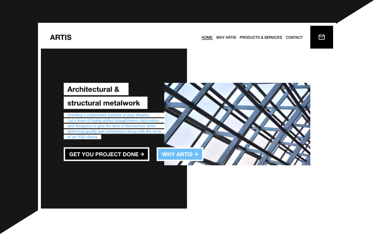
Client contacted me with a desire to get most of the clients via website. Goal is to present his company as modern, experienced, and high quality deliverables company.
Content strategy
We need content that will explain company philosophy, vision, and what Artis can do for page visitor. After I got the content I’ll start with creating wireframes. (Also, I created an information architecture, but unfortunately, I didn’t capture any of it for this particular project.)
Wireframes
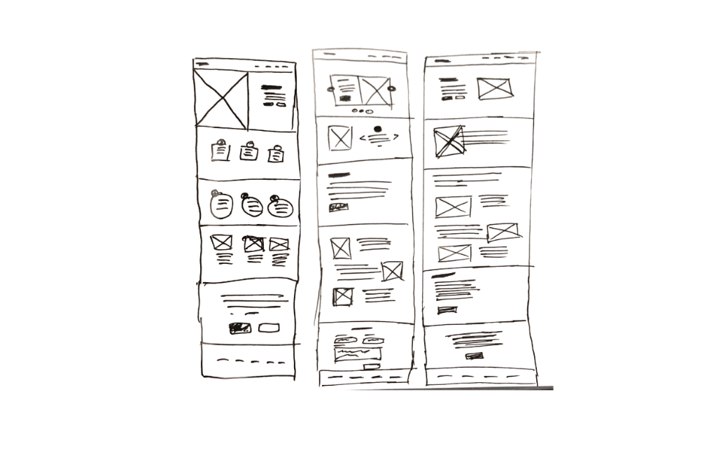
I created couple versions of wireframes where I would put the needed content.
Since company’s name isn’t so self-explanatory, landing section will have clear title of couple words that will company do, description bellow title that will
explain a little more about company, image, and of course, call to action buttons, one “GET YOUR PROJECT DONE” that will send visitor to the contact page,
and “WHY ARTIS” that will send a visitor to “WHY ARTS” page.
The last wireframe is the most similar to the final website.
As visitor scroll through the home page, it will come across about section, philosophy section, services section, and CTA or contact section. As you can see,
the actual order of section is different than on wireframe. I thought about it, and I got the conclusion that is better to present to the visitor the company’s
vision before we show them all the services they can get.
As we can see, creating a website is never a straight and complete process, we always can think of something that will potentially improve the experience.
Design
Next step in the process is actual design. In this step, we first talked about the style of the website. We talked about the colors and style. Since we want Artis to have artistic, modern kind of vibe, that is the direction we went through.
Color Scheme
Starting with the landing section, we needed some simple, artistic, modern looking, with a metal image. Because Artis is not an ordinary company, because Artis think outside the box, we want an image to be like that. Slightly going out of the box over neighbor section.
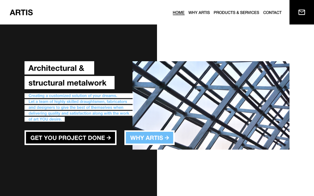
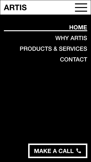
We want a client to be able to contact the company directly from the header, so we have “mail” icon that will open a mail client on click with predefined e- mail. We also want to be easily called from mobile phones, so in the mobile menu, we have “make a call” button.
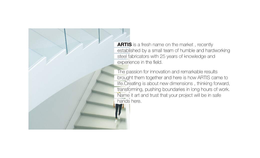
Artis is clean, fresh, modern, so section about Artis needs to be clean, fresh, and modern.
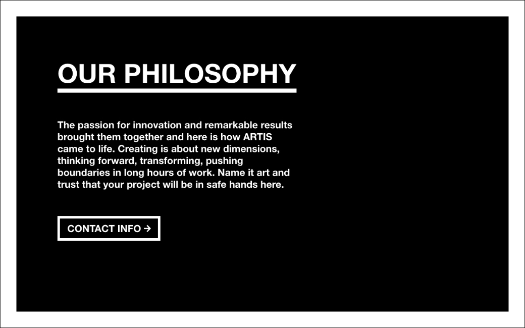
We need to tell our philosophy, it’s not just about metalwork, it’s about something much bigger!
After the design is “done” (You can see full landing page design at the bottom of the page), I presented it to the client, to find if there is something to edit or change. The client was approved very fast so I moved to the next step, development.
Development
Website needs to be rich in animation, parallax effects and nice looking on all devices. This process is pretty straight forward, since all design is approved,
development follows design specs.
I used Jekyll for development, jQuery library, style coded from scratch. Jekyll is static site generator, and with some integration is possible to have CMS with
only static files, without database.
You can see website online at this link.
