Client wants a landing page that will inform potential clients about company services, and convert visits to emails and phone calls. Client targets companies and people at the local level.
Content strategy
All content will be static, without a need to be updated in the future so we don’t need Content Management System for the landing page. On the same beginning we talked about the importance of content and what would increase conversion of landing page so before even starting with design Stefan provided me content for it.
Wireframes
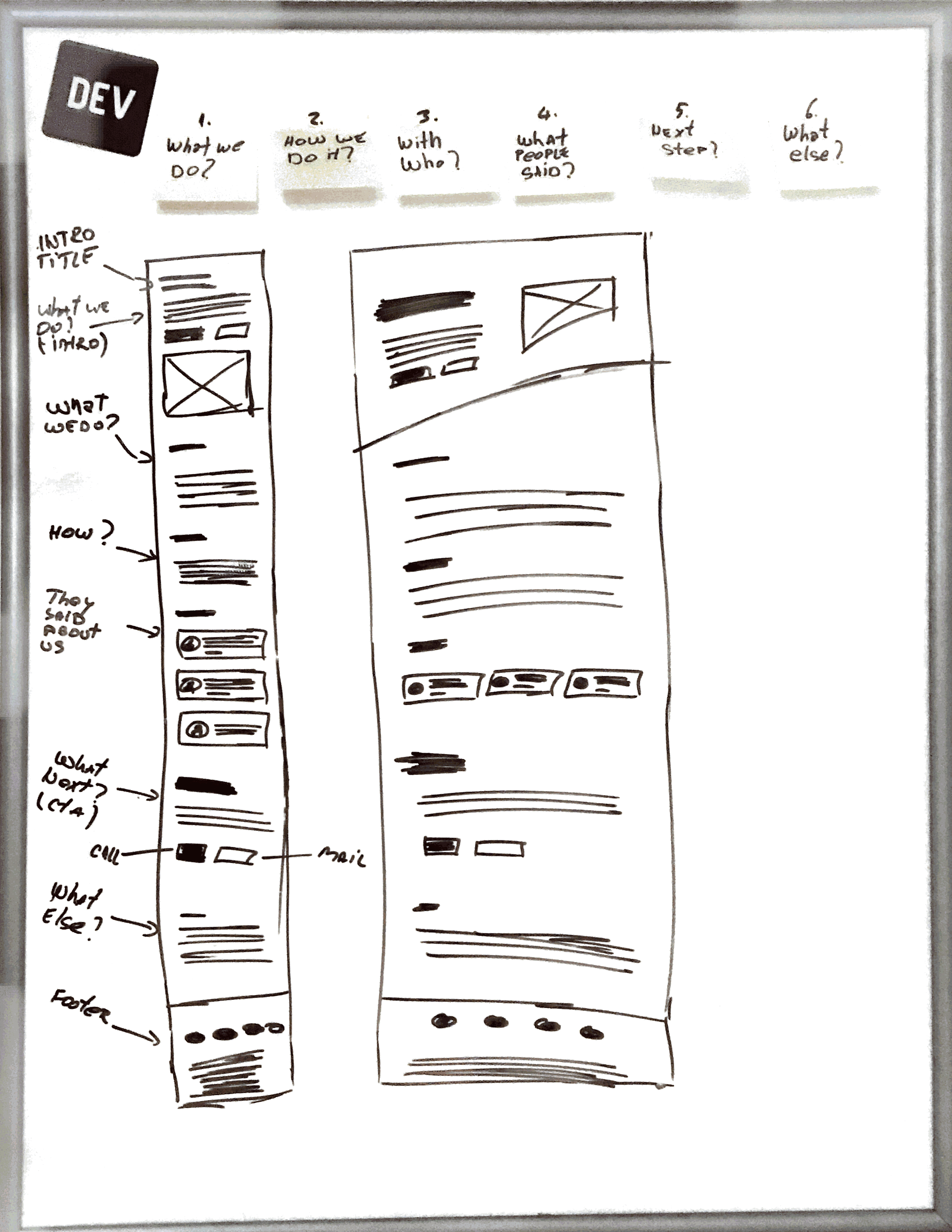
Based on the question visitors will ask, we will display our content. Those questions are already answered in provided content, but to avoid missing something out, I wrote them on sticky notes before starting with wireframing.

Landing page need to answer next questions:
What we do?
How we do it?
With who?
What people think about us?
What is next step?
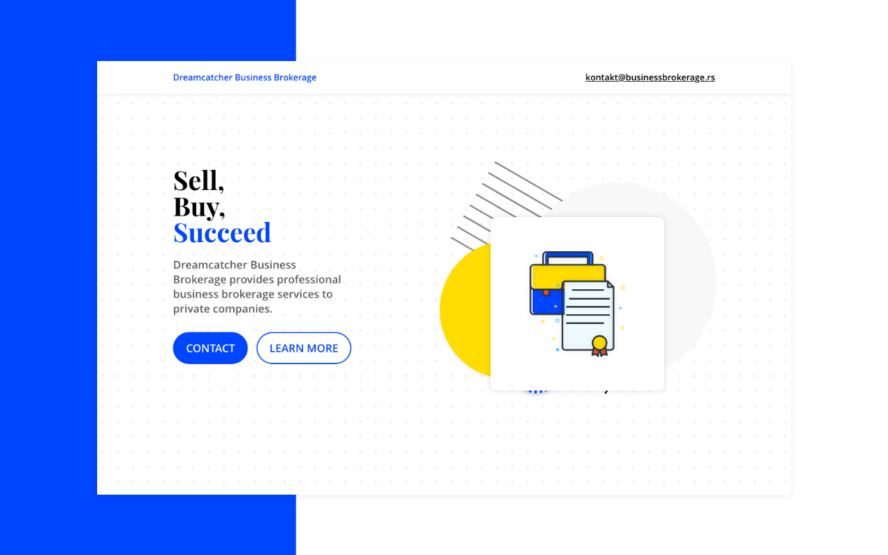
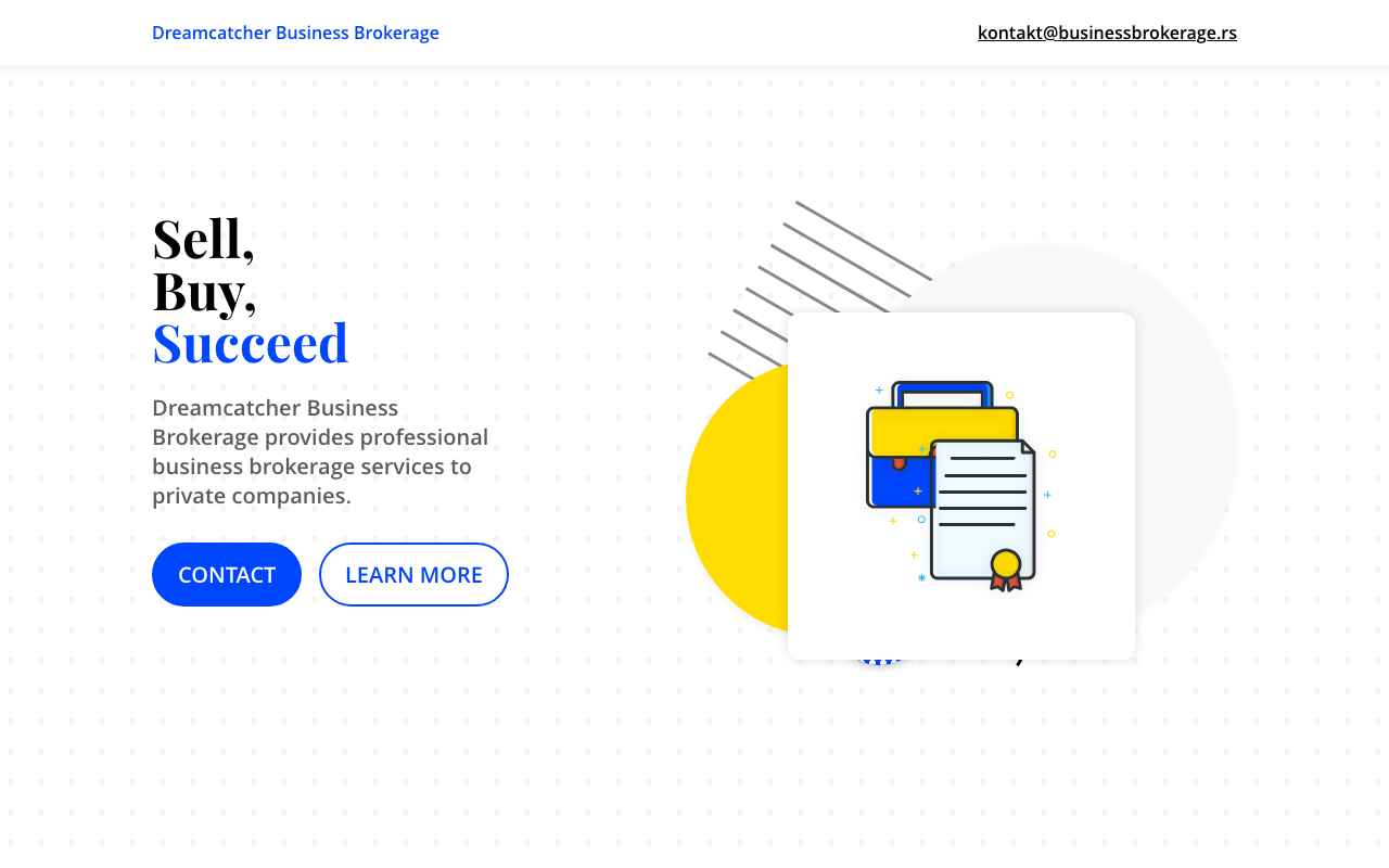
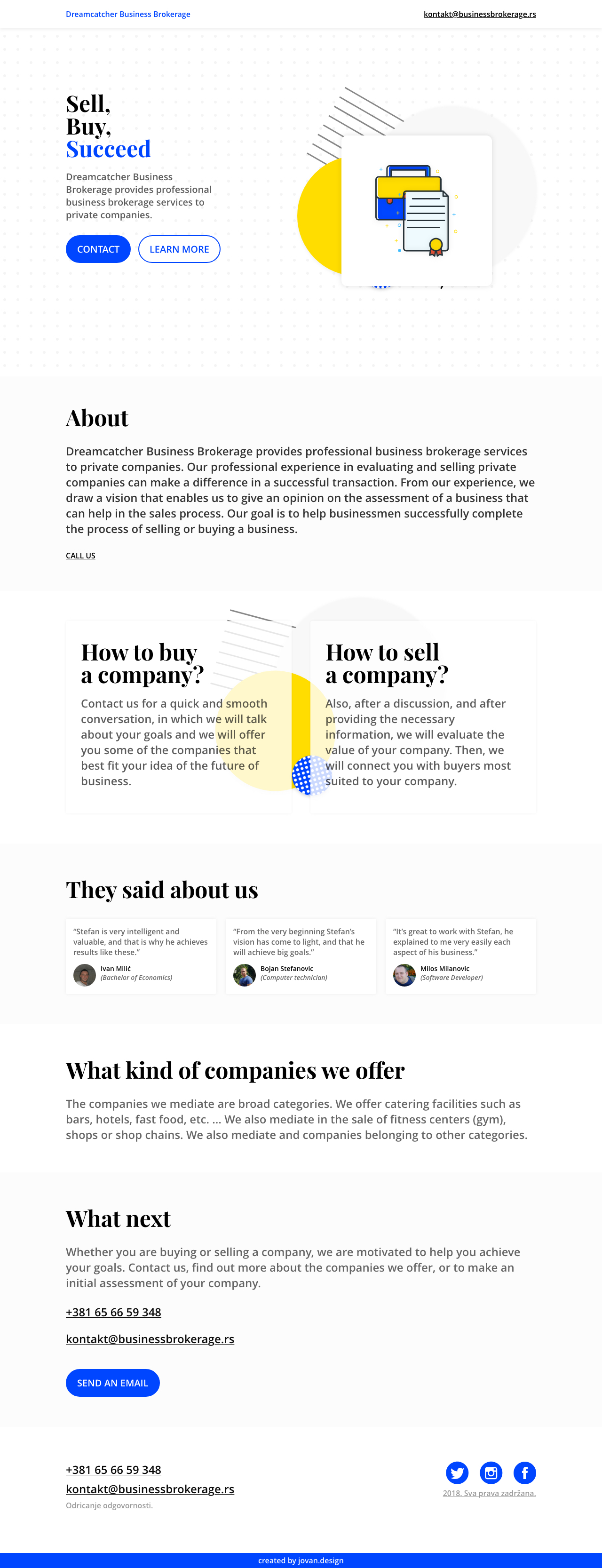
Wireframe consist of 5-6 sections. Intro, that is very important, with a title, short description, and call to action buttons. Also, there is an illustration that represents agreement/contract. In "About" section we explain a bit more about the company. In "How" section we explain how the process works and how someone can sell/buy a company. The very important section is "Testimonials", with 3 personas that told something about their experience in working with the owner. There is also section "With who" where we explain more about clients and companies, and "What next" section is a call to action section with contact information.
Design
When we have a clear vision, and structure of how content will be shown, we are starting with the design. In this case, after defining style, sections, and content, actual design will be a very straightforward process. After completing a design of landing page, I’m delivering it to Stefan for feedback, and after review, I make changes or go into the development phase.
Color Scheme
Starting with the landing section, we needed some simple, artistic, modern looking, with a metal image. Because Artis is not an ordinary company, because
Artis think outside the box, we want an image to be like that. Slightly going out of the box over neighbor section.
</p data-animate>

After the design is “done” (You can see full landing page design at the bottom of the page), I presented it to the client, to find if there is something to edit or change. The client was approved very fast so I moved to the next step, development.
Development
Website is powered by Jekyll, it's very light and with quick load time. It has discrete lazy load animations that gave a life to it. Also, it's mobile responsive, and on mobile phones are displayed also "call" buttons so visitor can call a company with just one easy click on the button.

</div>