3 Common UI Design Mistakes & How to Fix them
Bad contrast, no white space, and text inconsistency.
These 3 mistakes can make your website look amateur (but don’t worry, everyone made these mistakes), but if you take some time to fix them you will have a great looking website.
Bad contrast
Bad contrast is one of the most common mistakes I see on websites. And I don’t think just about color contrast, I think also about bad contrast when we look at a text or other elements.
As you need to make sure your colors have a good contrast, your text needs also to design so it’s easy to notice what’s important and what not.
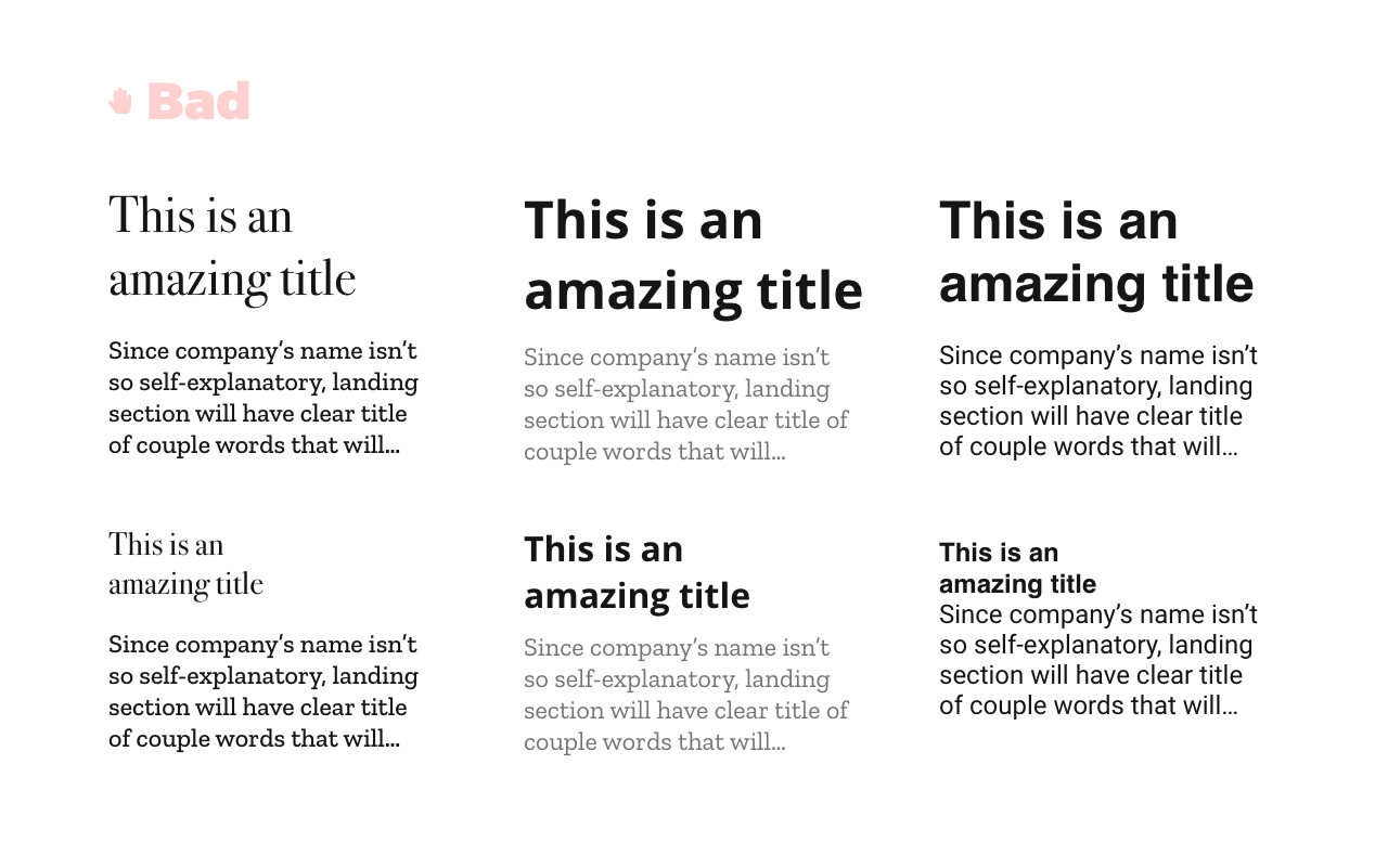
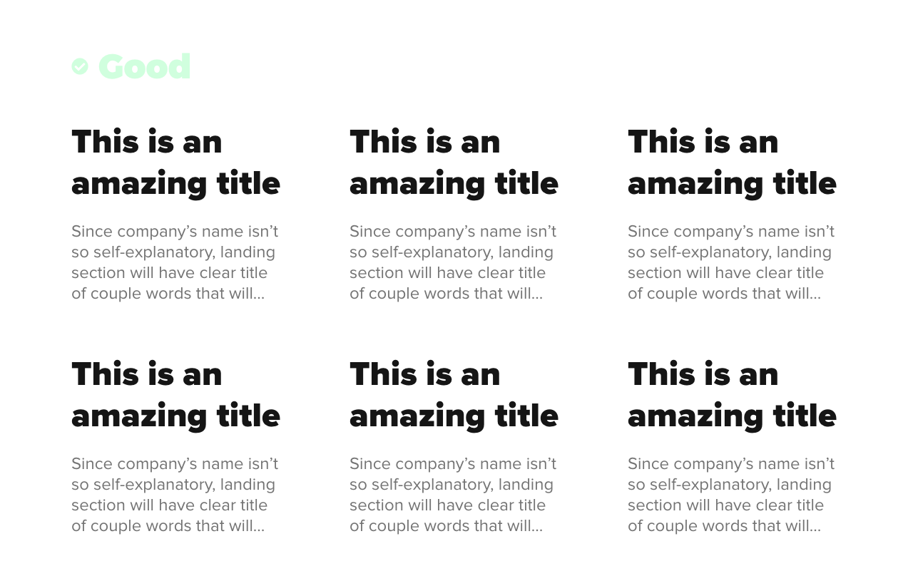
One trick I use to make sure my text has good enough contrast is to double the size/weight by importance.
So, if the title is more important than paragraph beneath it, I would double the size of the title, increase the font-weight, and frequently make it darker than a paragraph.
In the example above, the paragraph has 60% opacity, font size 24px, and font-weight of 400. The title has 100% opacity, font size 48px, and font-weight of 900.
Bonus tip: Space between title and paragraph is half of title font size (in this case it’s 24px)
No white space
No white space (no negative space) is a space without any content. It doesn’t have to be white, it’s any space without content.
The idea of negative space is to sort content on your website so users can ‘breath’ and won’t be lost in the content. Having a bad negative space is similar to having a messy room and not knowing where to begin with cleaning.
How you can improve negative space on your website:
- Separate content in sections with space around/between them,
- Improve spacing between title, subtitle, description, images, etc…
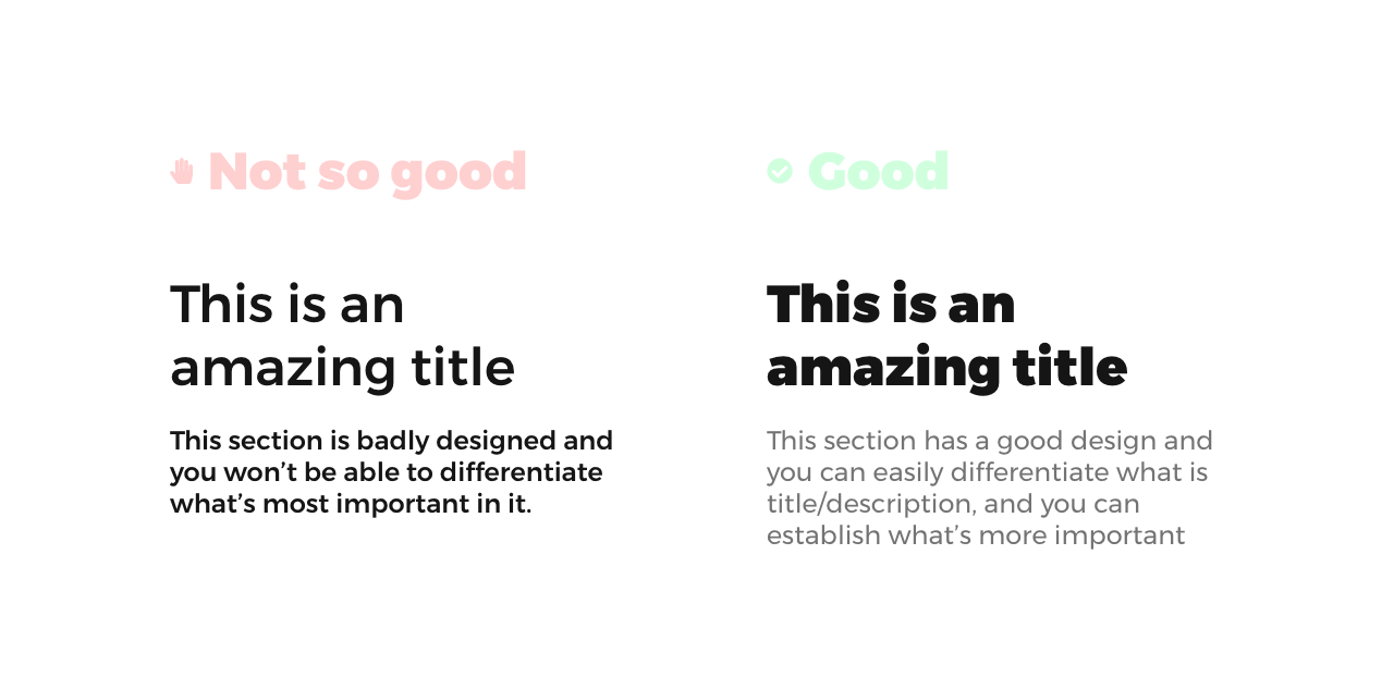
We just increase font-weight for a subtitle and added divided content into sections, and our design it’s already better!
Text inconsistency
Don’t use too many colors or too many fonts for your text. You can use multiple font families, but in most cases is not recommended. Just use the same font family with different weight, size, etc.. And, also, be consistent with it. Use the same style for the same element (title, subtitle, button, paragraph, etc..), across all parts of the website.